UX/UI Design, Product Design, Marketing
DealActivator, an existing business and product line, aimed to expand beyond its CRM/Lead Generation SaaS by enhancing its feature set. The goal was to provide greater value to its current clientele and increase market share. Additionally, the company sought to modernize its UI, improve overall UX, and explore potential rebranding or brand realignment.
Solution
Collaborating with the Creative Director, we initiated a comprehensive UX process, engaging all areas of the business. Through creative workshops and fact-finding initiatives, we leveraged insights from multiple internal teams to deliver a fully rebranded product package.
My Role
As the Senior Interaction Designer, my primary responsibility was to ensure a seamless user experience while expanding the product’s capabilities. As the sole designer on the project, I also took on a generalist role—contributing to product definition, usability testing, project management, and marketing during the final stages.
Backstory
We had just wrapped up a UI redesign and feature audit, which leveraged our just released company-wide design language when I got tasked with leading a brand and product design pivot. The business wanted to enhance the current product offerings with new technology. Such as computer learning to help rank potential car buyers. Develop a complete automated multi-channel marketing solution backed by AI, not to mention a possible new business name and brand realignment.
Steps Taken
Initial mocks, prototypes, and testing
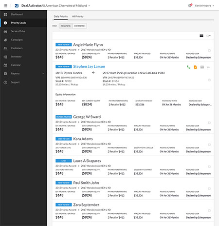
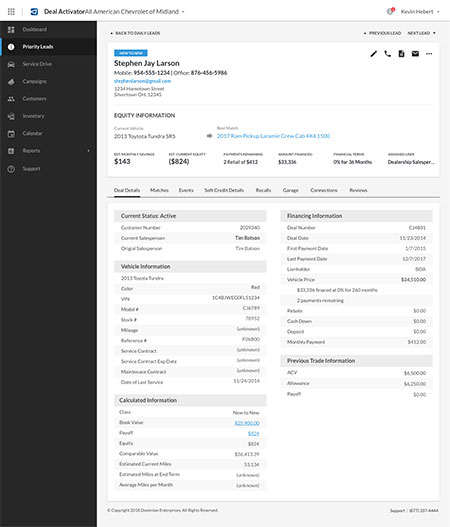
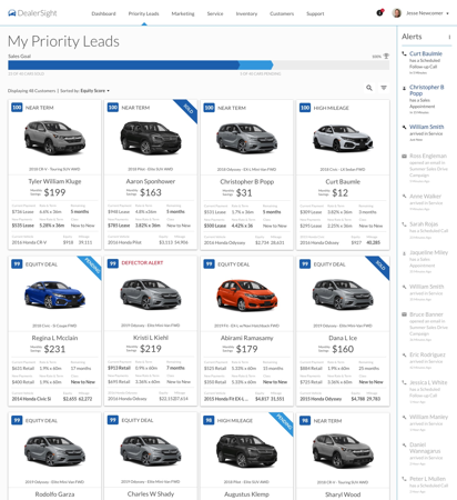
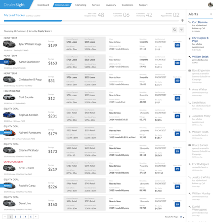
Working alongside the creative director, we started with competitive research. Knowing the high-level objectives around the pivot leadership said they wanted to take. The main feature we saw during our research and heard mentioned during user interviews was a desire for a scoring system for leads. This feature was in use already by a few of our competitors.
To determine the viability of how to leverage this type of grading logic, we conducted a blind A/B user test of our proposed workflow, comparing it against competitors. Doing so validated our ideas and helped identify some areas for improvement. I then worked with the project manager and product owner to write out and vet the acceptance criteria for this new functionality.
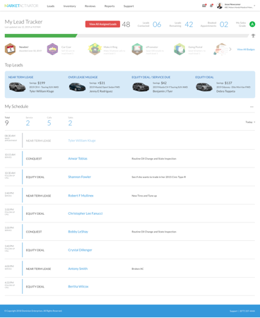
Identify and define persona and user roles
To help ensure we covered our various user types across our expanded product set, we had a series of meetings with all the company stakeholders and SMEs to review and define our user roles and personas. During a series of workshops, we divided our users into two groups; internal and external users, who had unique needs from the software.
We further organized our external users into four tiers based on the level of information and depth into the software their workflows required. The user types were then assigned personas with identified pain points and use-case goals to guide product decisions.
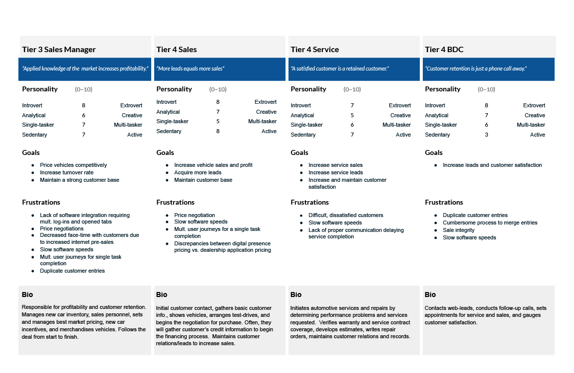
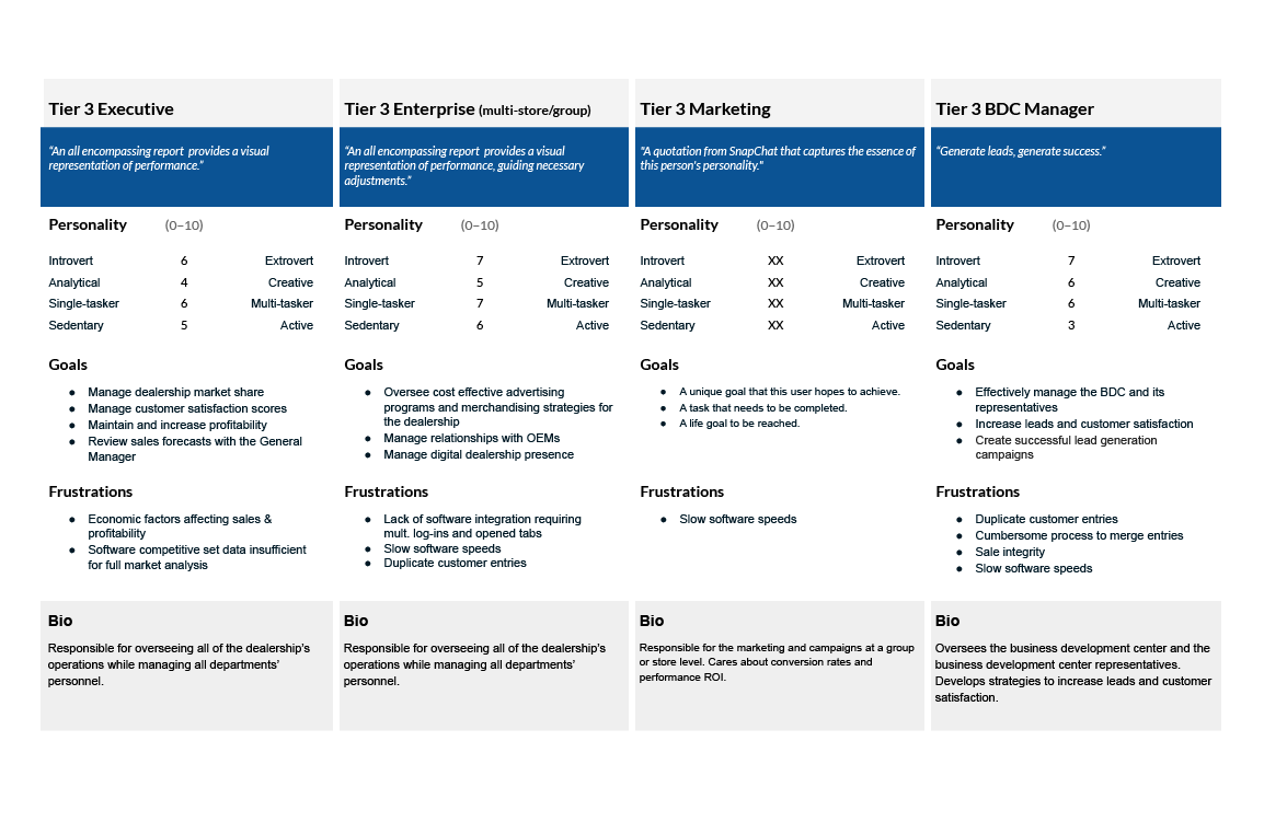
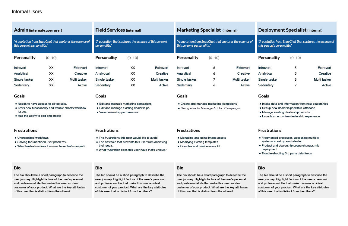
Mapping out feature sets and how roles apply
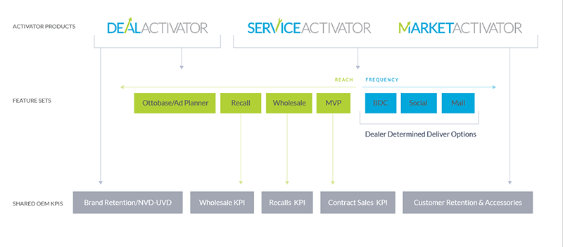
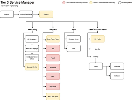
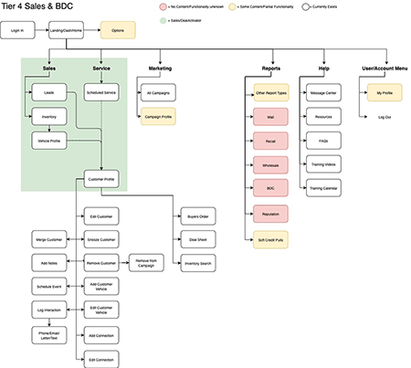
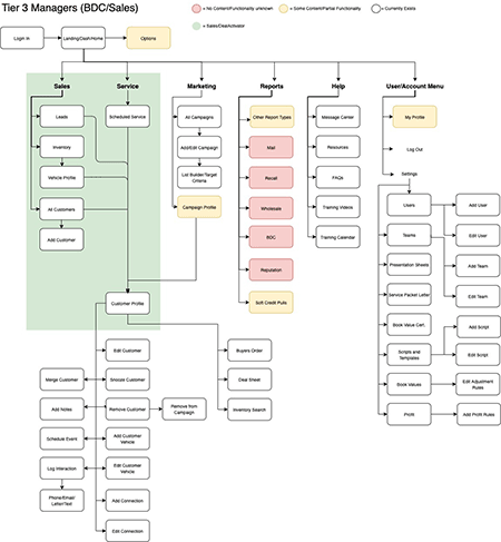
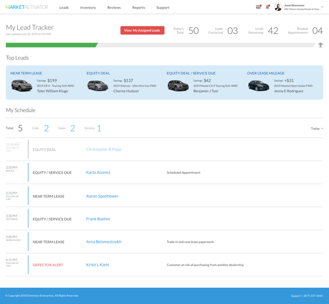
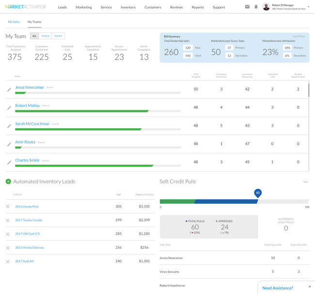
Now that we had a suite of personas and use-cases to solve against, I needed to draft a plan to organize the existing product and business groups. I then took each product scope and developed user maps for all pages and touchpoints that each user role could and should entail.
Another facet that I was involved with was helping our data team determine how the customers' interactions at various stages of conversion, combined with vehicle service and equity data, should dictate variables in the user experience. We used that data to filter what would be shown or hidden for each role within each product set.
Brand discovery, and the birth of Otto
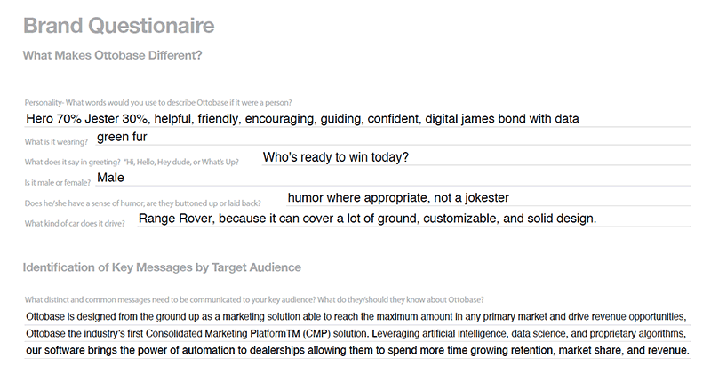
With our technical objectives defined, it was time to apply cohesiveness to what we were making. To help with this, we held a series of workshops with some of the key leaders who were driving the new business direction, during which we asked some fun questions and got to the root of how we should present the brand. We identified key strengths and market differentiators to focus on in our messaging.
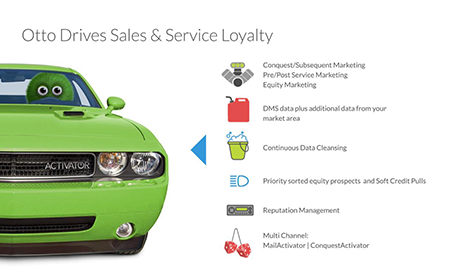
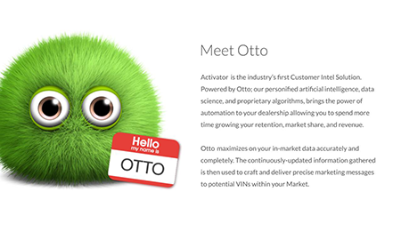
Around that same time, the creative director came up with a personification of the algorithms that power our software, named Otto. The team now had a face and a personality to define a brand.
Branding defining, guidelines, and pattern library
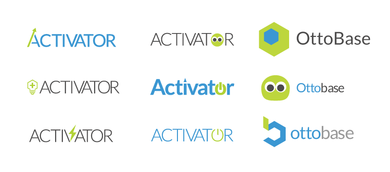
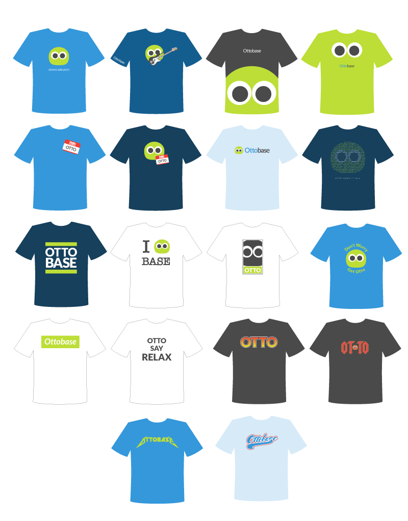
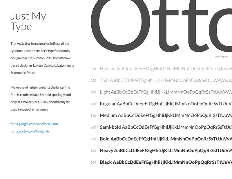
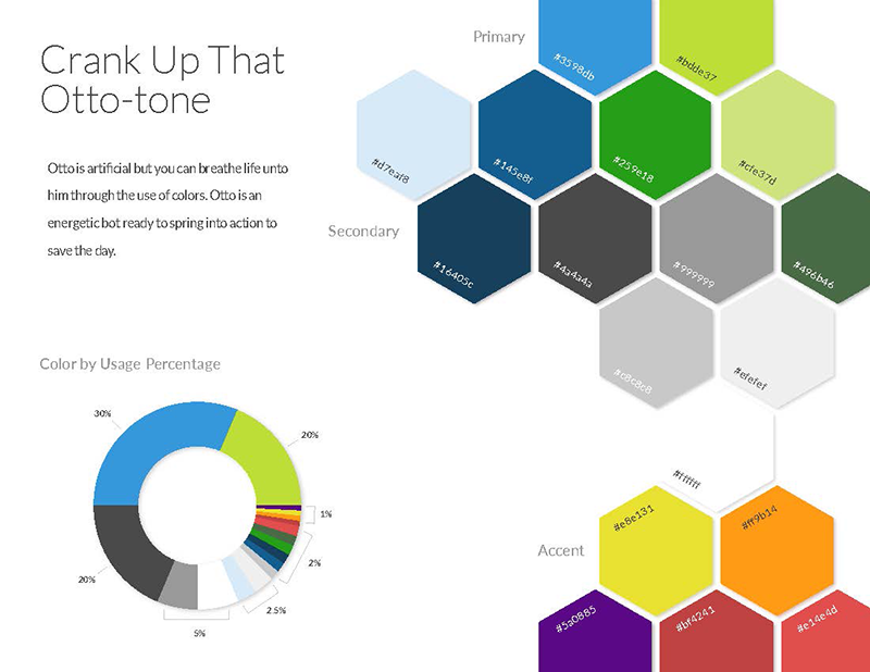
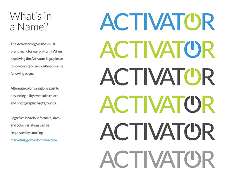
Using what I had learned during our brand discovery workshops and using the design direction I had started to go in with the UI as the foundation for visual rules, I partnered with our copywriter and started creating a brand guide. While at the same time, I was going through logo exercises. For a while, Ottobase was a front runner but ultimately lost out to Activator late in the process due to some political reasons.
Defining targets and touchpoints
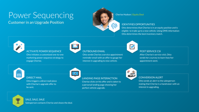
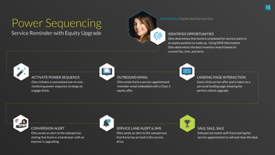
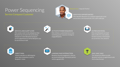
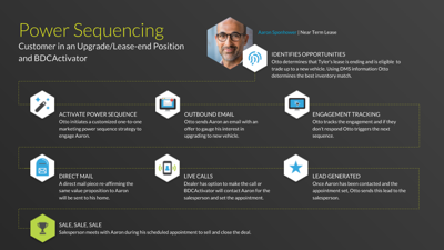
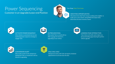
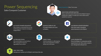
Automated marketing was the core of our new business model, and with that came new features to define and workflows to create. To ensure the automated rules that we were drafting would hit the right customers with a timely message during their car ownership lifecycle. I composed several potential car customer personas, outlining how they would interact with our marketing products during their car-buying journey.
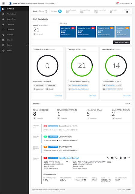
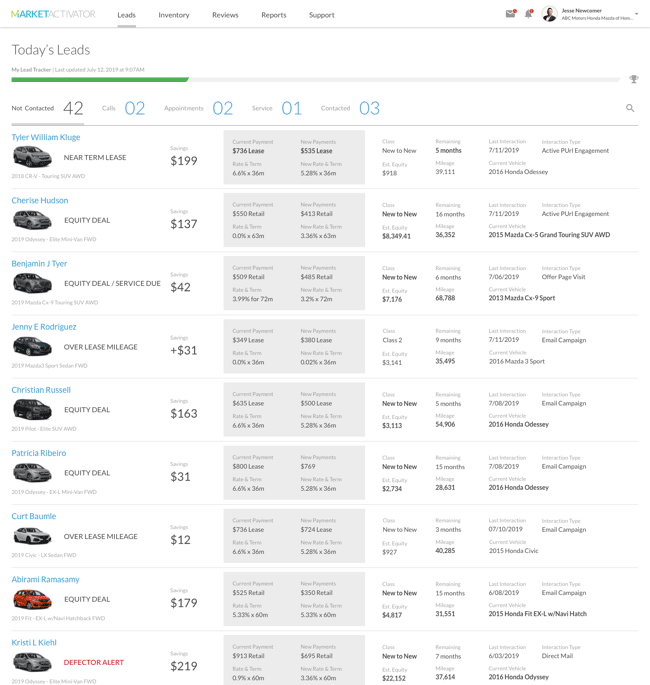
The customer journeys also helped guide the hierarchy of information on our customer detail page, keeping in mind the type of customer and their potential user goals. Doing so provided a framework for presenting the overwhelming amount of data on customer vehicle ownership and deal history. With the primary goal to help a car sales representative easily make a deal.
Trade Show appearance
The 2019 NADA trade show (the National Automobile Dealers Association) was to be the debut of the new business model and Otto. The event brought about additional challenges and requirements, as we were still in the midst of active development against a defined roadmap. Due to this, I also supported several development teams and their scrum processes while still defining the branding materials.
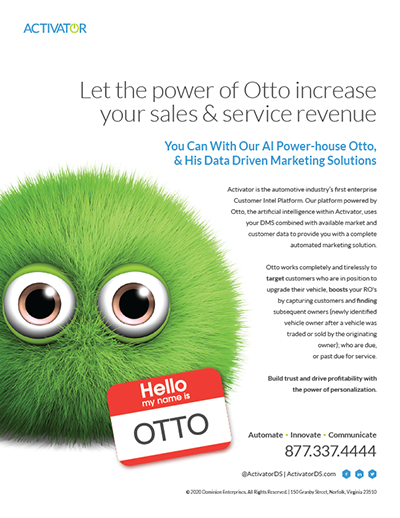
Shifting gears, I helped the marketing department with a brochure design introducing Otto and the software. The prospect of working on a physical design piece intrigued me as it had been a while since I had done any print work. Taking my role as a user experience designer to a tangible task, I started by thinking about how this brochure was a leave-behind for potential customers after product presentations. So I felt the piece needed to be more than a simple three-fold brochure or loose stack of laser prints if it were to garner any sort of attention at all.
The format my mind kept going to was the album cover and CD booklets. As a teenager, I loved looking at the variety in artwork and presentation styles each band would use. With their unique square format and creative folding methods, I wanted to elicit that same type of feeling when opening this product brochure. Using an 8x8 inch 8-panel accordion fold gave an ample size cover to introduce the product. The accordion fold-up provided the perfect reveal and stage for feature introduction.


My other deliverable for the trade show was to wire up a robust prototype aligning with the sales track stories previously identified for demo use during the event. A brand announcement to our existing client base also had to be crafted, explaining the changes they would soon be seeing to their accounts.

Sales and Marketing plans
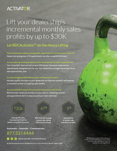
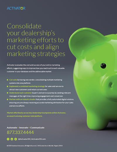
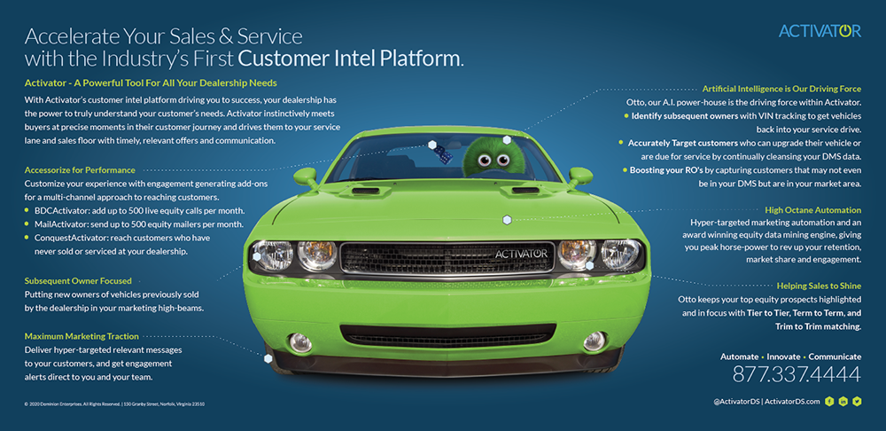
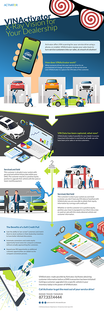
With our new product line branded and successfully launched, who better to facilitate the base set of marketing materials than the designer who helped make the product. This endeavor set off a new series of meetings with our top sales reps and sales engineers to learn what materials are helping and get feedback on effective messaging.
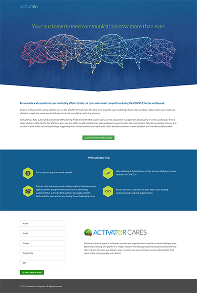
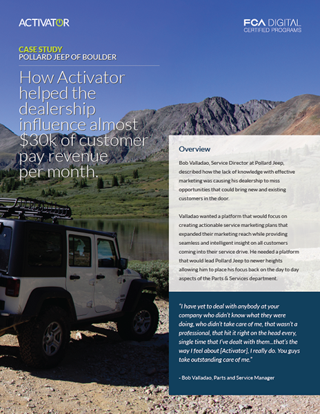
In doing so, we identified KPIs to market with and how we wanted to present Activator. The strategy was applied to a lead generation marketing website, along with a collection of sales materials such as sales sheets, infographics, and other supporting materials.


Applying the Brand
Some of the last deliverables required were to apply the new brand standards to various internal materials such as email signatures, slide deck templates, and business cards, to name a few. This effort took me into every corner of the business as we applied the new look and feel to all the white-labeled products we had subscriptions to. The last step was distributing our documents and brand guidelines to all who needed or wanted them.
