Creative Director, UI Design, UX Design
2012–2015
A Corporate Acquisition
In the spring of 2011, I began as the Creative Director for Homes.com, eventually overseeing a team of 4–6 designers, both local and in remote offices. The creative team supported product, sales, and marketing for all design needs. When I started, all of these teams had their separate design resources, standards, and patterns in use. This provided an exceptionally disjointed experience for our users. With numerous products supported by many teams, organizing a visual language to unify the brand was no simple feat. I started small defining the design language with a simple logo, type, and color rules.
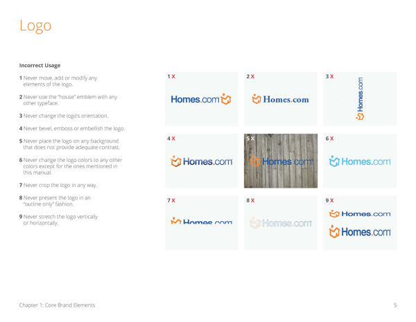
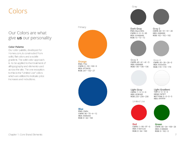
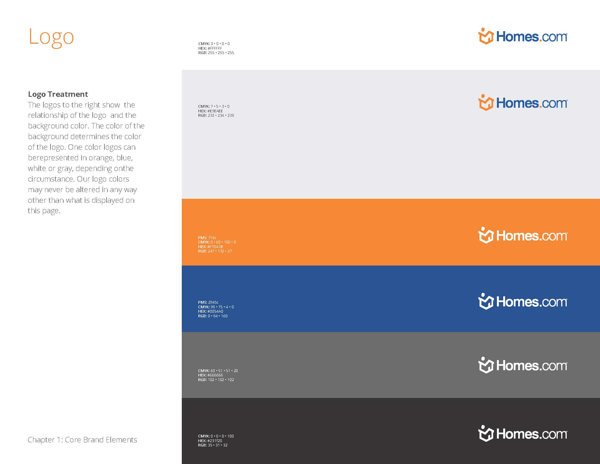

After implementing the newly defined standards across the suite of digital products; consumer-based real estate portal, mobile web, and app versions of the search portal, along with our agent and enterprise administration tools and software. The rest of the business leadership group saw the value that thoughtful design could bring to our product lines.
Establishing Roots
After we achieved a unified brand representation across all product lines, the team's next goal was to establish a consistent user experience throughout our digital assets. With guidance from the product team, we began by targeting our highest trafficked sections of the website.
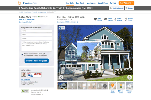
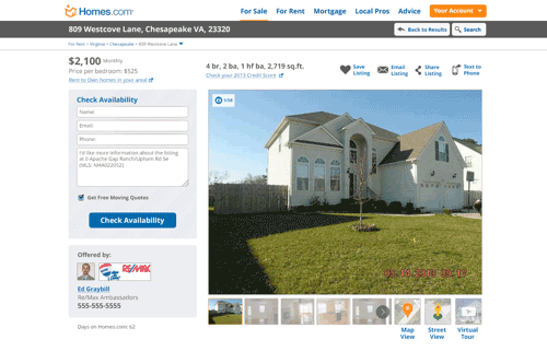
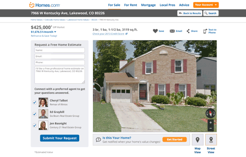
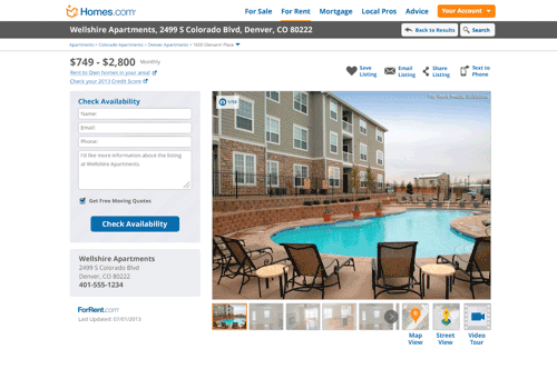
We began our process on the most important page to the user and the business: property detail pages. Different property types came with differing sets of content. Defining patterns on this suite of profile pages allowed us to establish the bulk of the design patterns and provide better consistency throughout the user experience.

Testing the Market
At its height, we were reporting 14 million unique page views monthly. Having such a large pool of live users allowed us to run numerous concurrent tests, segmenting users by metrics such as by region, or search type to utilize as our test groups. Using tools like Test & Target, and Optimizely to automate and track numerous tests simultaneously. We used this valuable resource to consistently improve our lead forms and advertising conversions, by applying the winning patterns across all products lines.





Winter is Moving
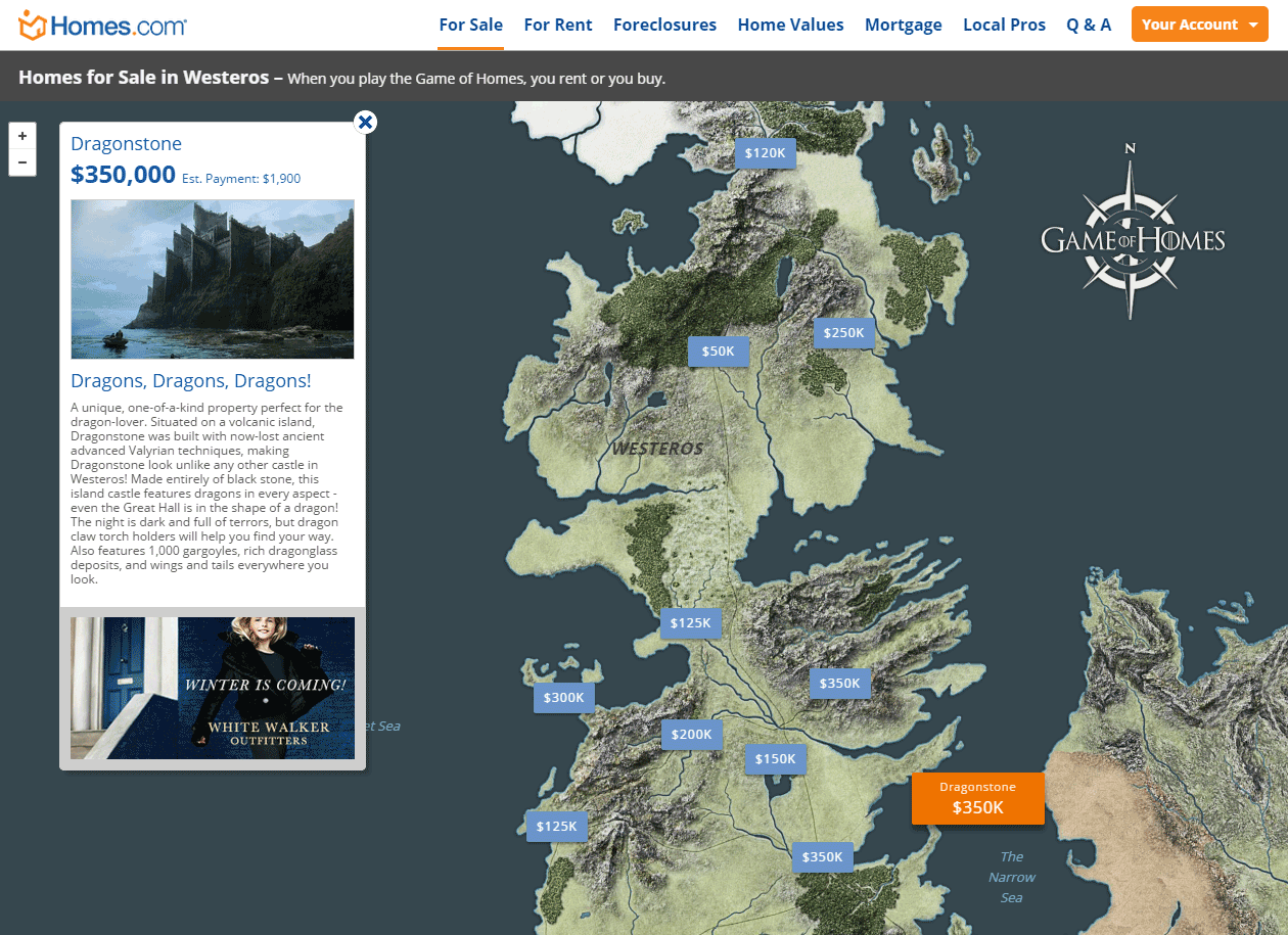
Supporting Homes.com also provided some opportunities for fun and experimentation. To help generate some marketing buzz, working with our marketing department, my team and I made a Westeros home search parody based on Game of Homes. We created it using PHP and Mapbox, Eva Petersen and I did the design work, and Rafael Calderon created the map and Mapbox integration.
Although it is no longer online there still exists an article about it.
Sliding into First
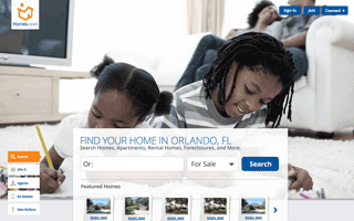
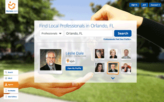
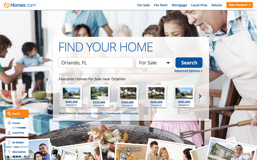
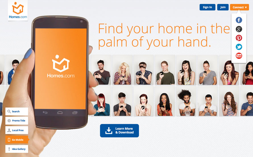
Another way I was able to create some industry buzz was by being the first in the industry to design a parallax scrolling homepage. This new homepage featured a focused approach to introducing the brand and the start of the search funnel, which improved our initial search form conversion rate.
Media metions:
marketing.homes.com
vendoralley.com
