Art Director, Graphic Design, Woodworking, Bassist, Branding
2015
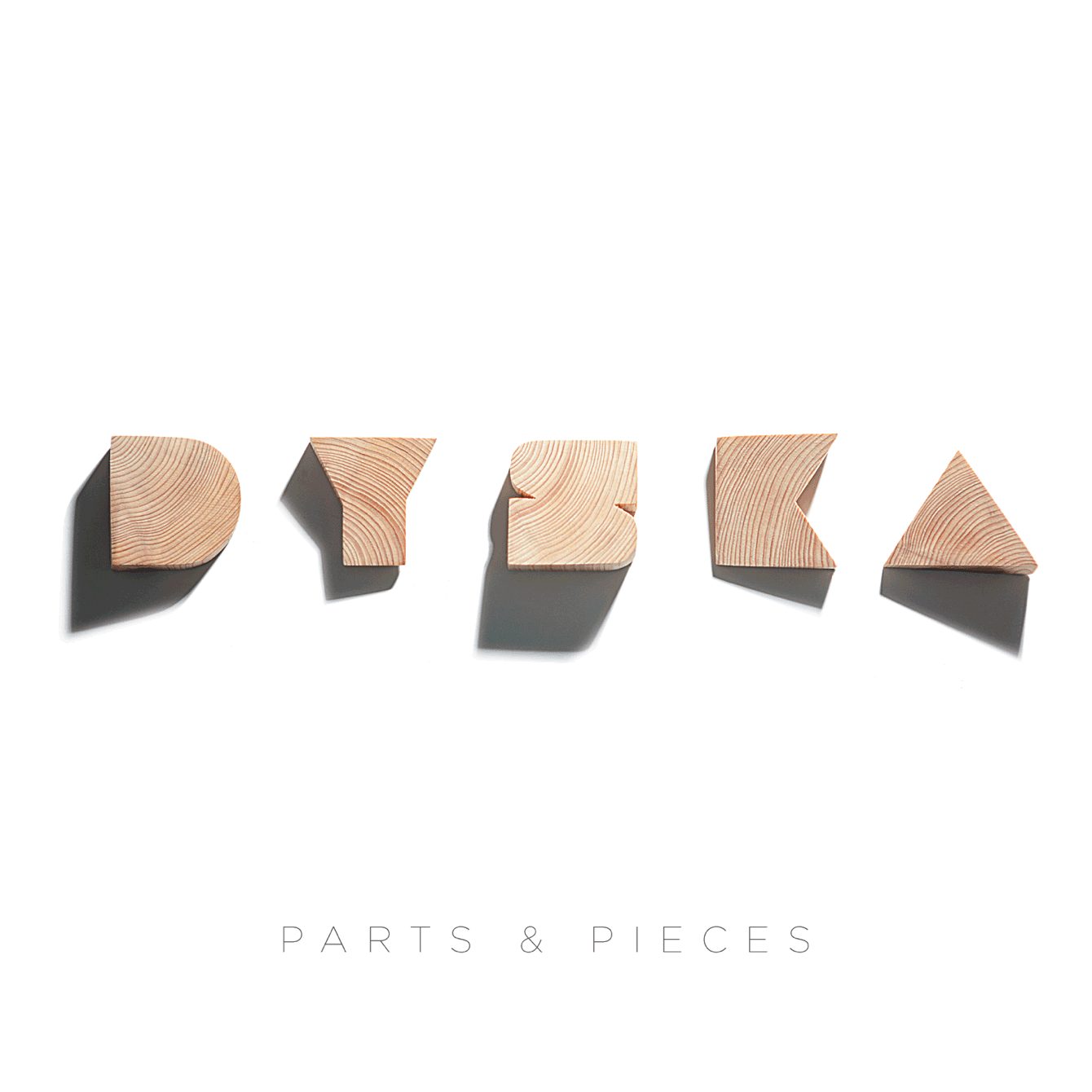
A great album needs a great cover; this was the challenge and opportunity I found myself facing during the summer of 2015 as the band I belonged to was finishing up our first full-length studio album.
The Solution
Working with photographer Jitu Rashad, we explored the play between contrast and lighting to produce compelling visuals using simple objects.
My Role
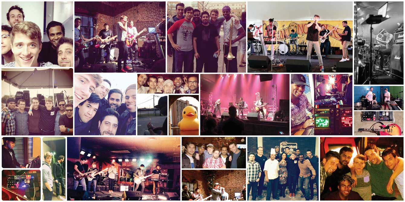
As sole creative and founding member of Dyska, I had complete creative freedom with the challenge of having a 5-panel board (the rest of Dyska) as primary stakeholders.
Unexpected Inspiration
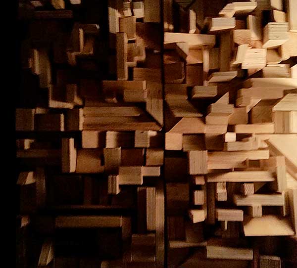
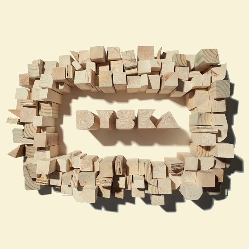
The studio Dyska was recording at (Whalehead Studios in Hampton, VA) had some sound baffles in the production suite that caught my eye, constructed from random-sized and shaped scraps of wood that somehow, altogether formed a perfect square. The way the individual pieces of wood captured the dim light in the lamp-lit room, and the long shadows they cast, reminded me of being high above a city scene at sunset. This small piece of functional art would be the inspiration behind my design.
Logo Fabrication
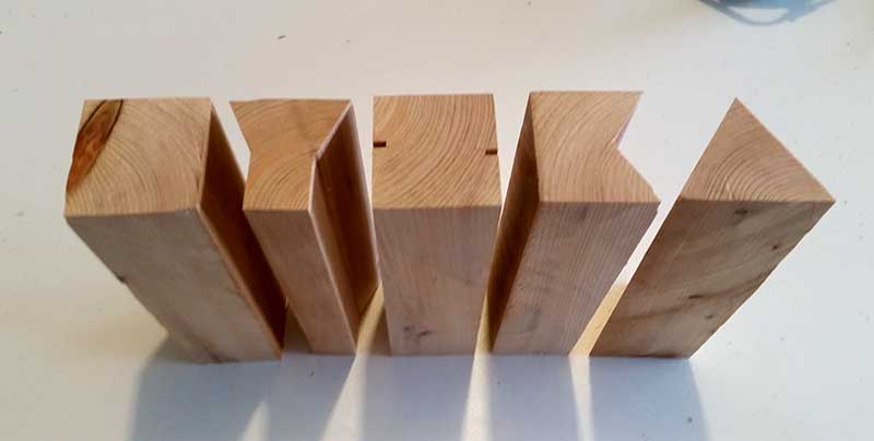
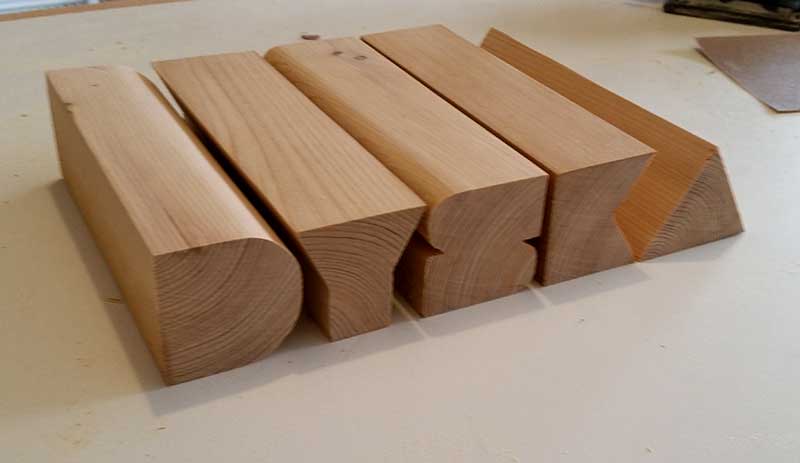
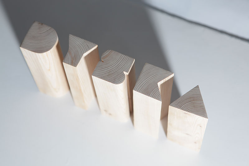
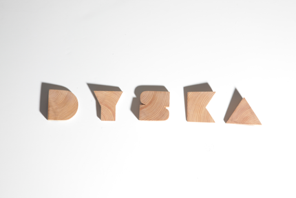
My first challenge in creating my cityscape idea was to craft the band's logotype. Luckily, the typeface I used when creating the logo was a large and blocky display face, making my task of recreating out of wood much simpler.

Another hobby of mine is woodworking, so I had all the needed tools and materials at my disposal for creating the materials my concept would require. To make the logotype, I chose a block of cedar I had. Knowing the natural reddish tones would look great against white.
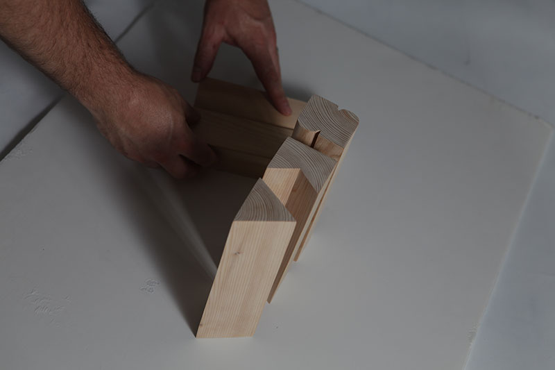
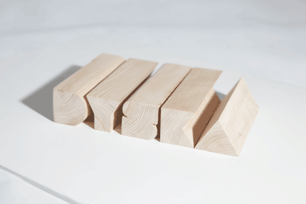
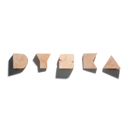
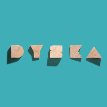
I primarily used the table saw to create the letterforms by first cutting long blocks for each letter. Then, carve away the space leaving me with chunky strokes that I sanded to their proper shapes.
Making Parts
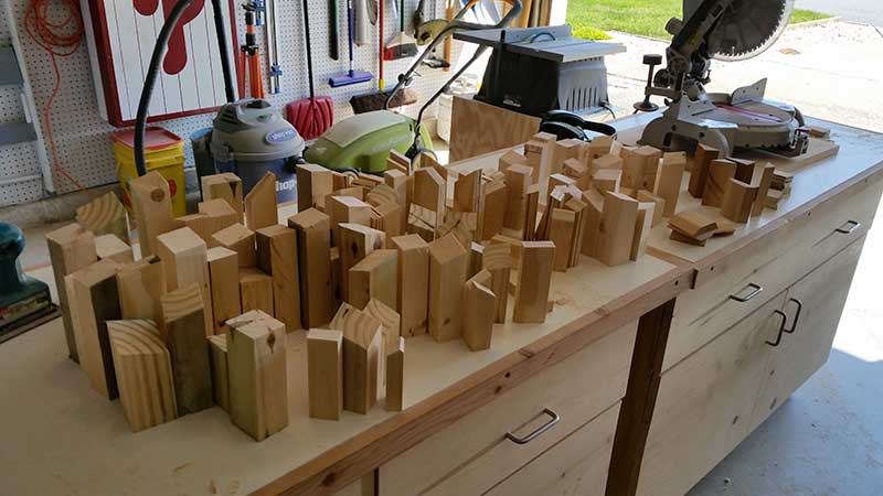
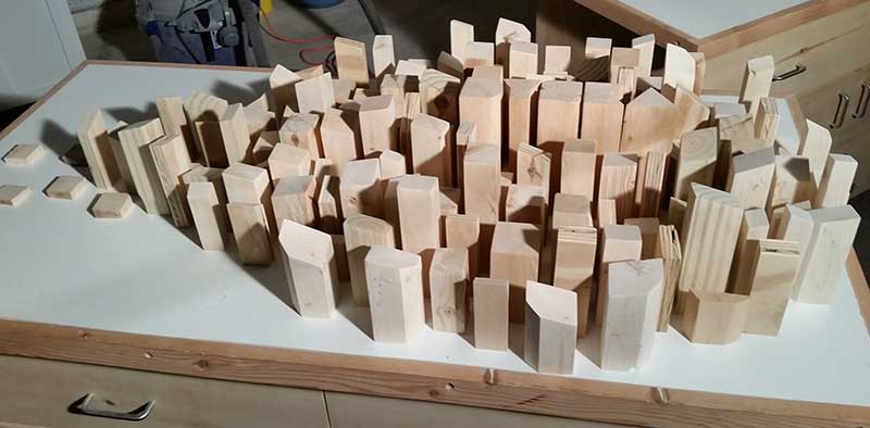
With the band mark made, my next step was to produce the rest of my city. For the buildings, I dug into my stockpile of lumber. All saved from past projects. I took various cedar planks, 2x4s, plywood and cut them into numerous building-shaped pieces. These blocks received a quick sanding once over to save everyone's hands from splinters.
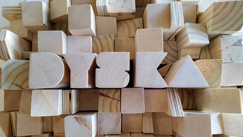
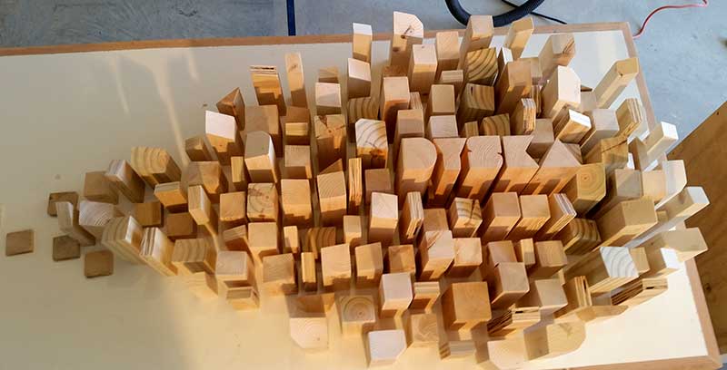
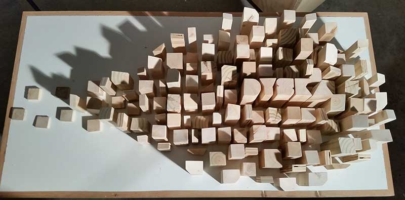
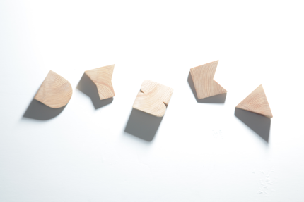
Armed with my freshly made box of blocks, I made several test shots in my garage to present to the band. During these initial test layouts, I noticed the Dyska letters felt too tall next to the city blocks around them. While trimming those shapes shorter, I wondered what type of shadows some smaller irregular angled pieces might cast. These pieces were cut and set aside. After a quick test shot, I tossed them in the box, quickly forgetting about that idea as I went back to play with my city.
Production and Pixels
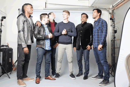
Once I received band approval on the concept, we scheduled a photoshoot with local photographer Jitu Rashad. On the day of the shoot, after we did several group shots, I asked all the band members to play around with the various layout of the blocks and letters. Meanwhile, Jitu cycled through camera settings and experimented with lighting, rapidly firing off shots. As we quickly set up and rearranged blocks and letter shapes. Our efforts produced a large selection of potential options to review.
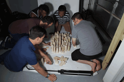
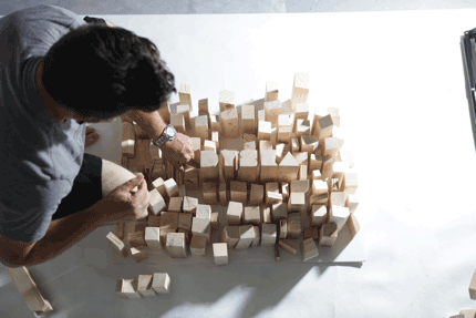
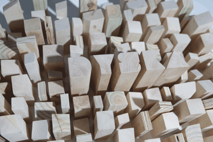
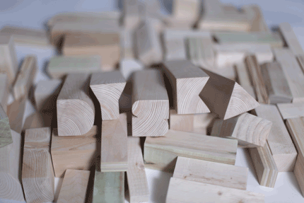
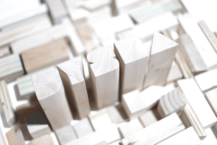
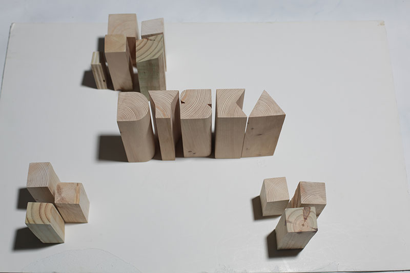
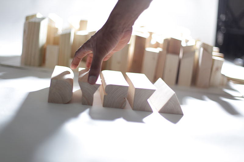
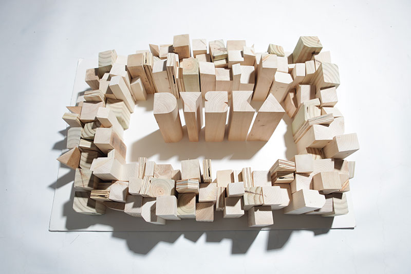
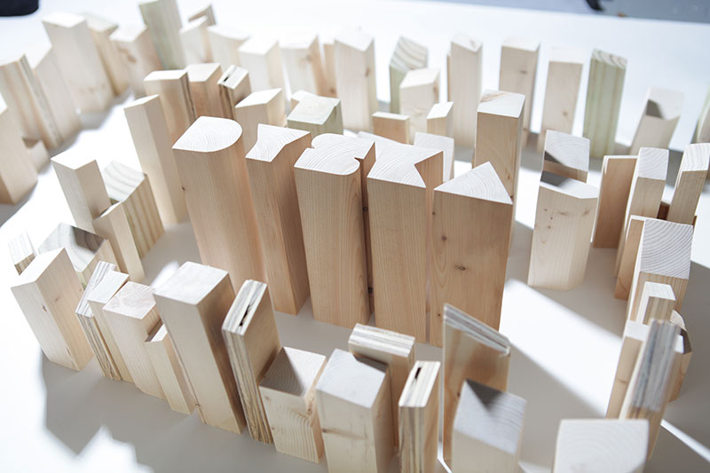
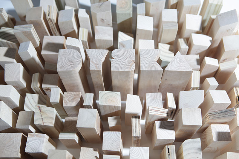
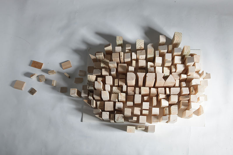
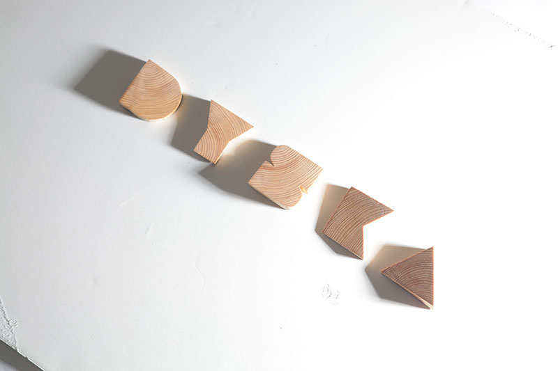
Jitu and I also decided on-site to try some shots of the letterforms on their own with harsh lighting and long shadows. At this point is when I remembered the odd angles I had cut and tossed aside. We tried some quick variations with those before wrapping up a long afternoon of shooting under hot lights.
Choosing Pieces
Having so many layouts and photos to review was overwhelming at first, having hundreds to sort through and filter. Ultimately it was fun playing with all the different staged scenes in Photoshop, experimenting with aggressive crops, or adding colored overlays.
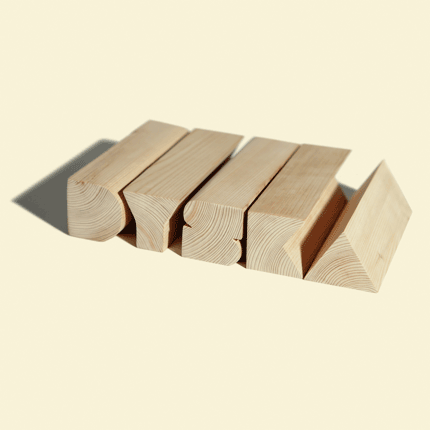
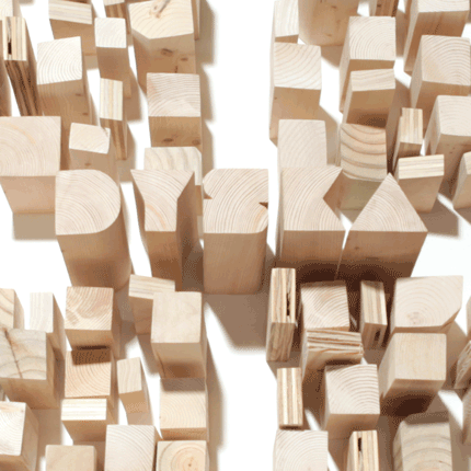
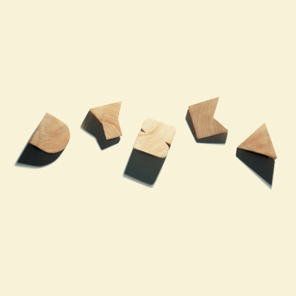
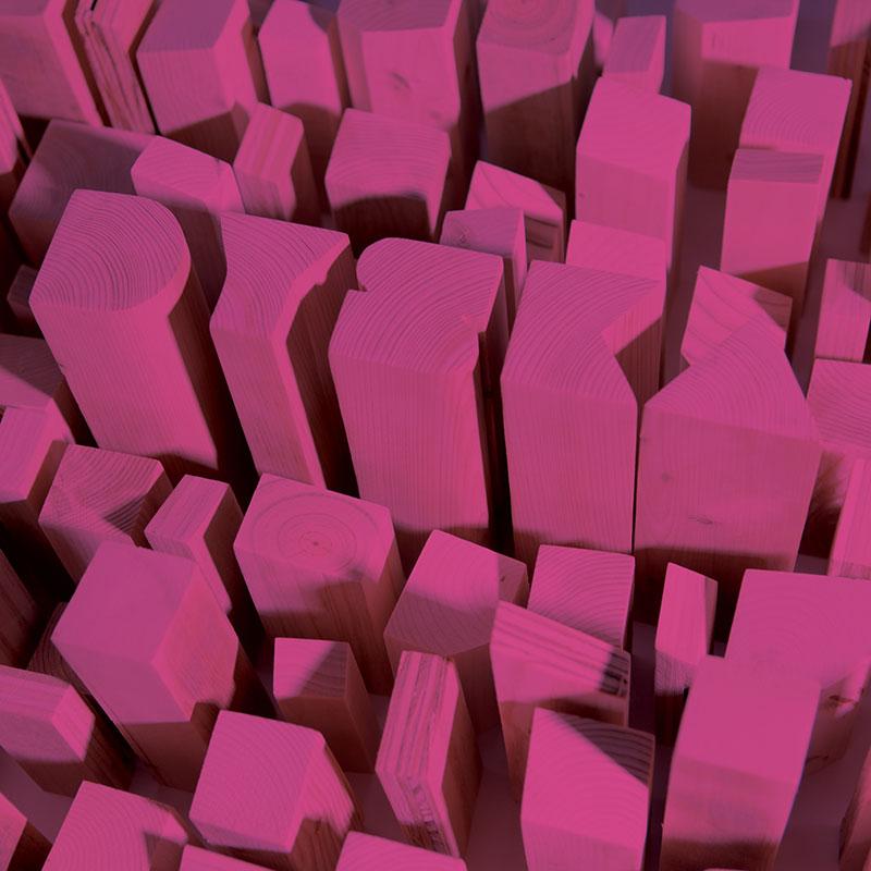
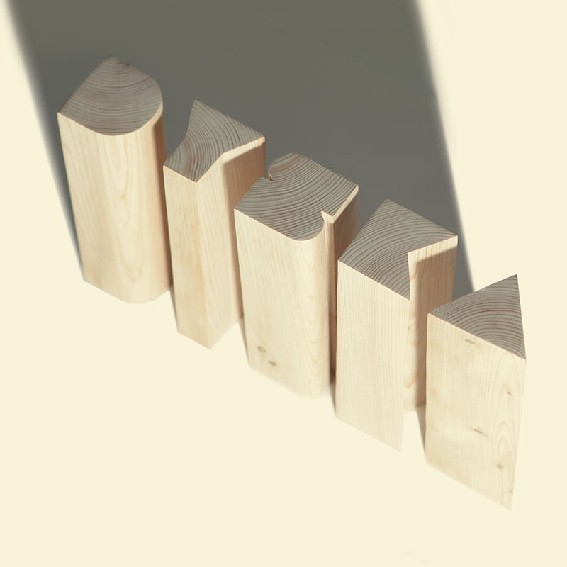
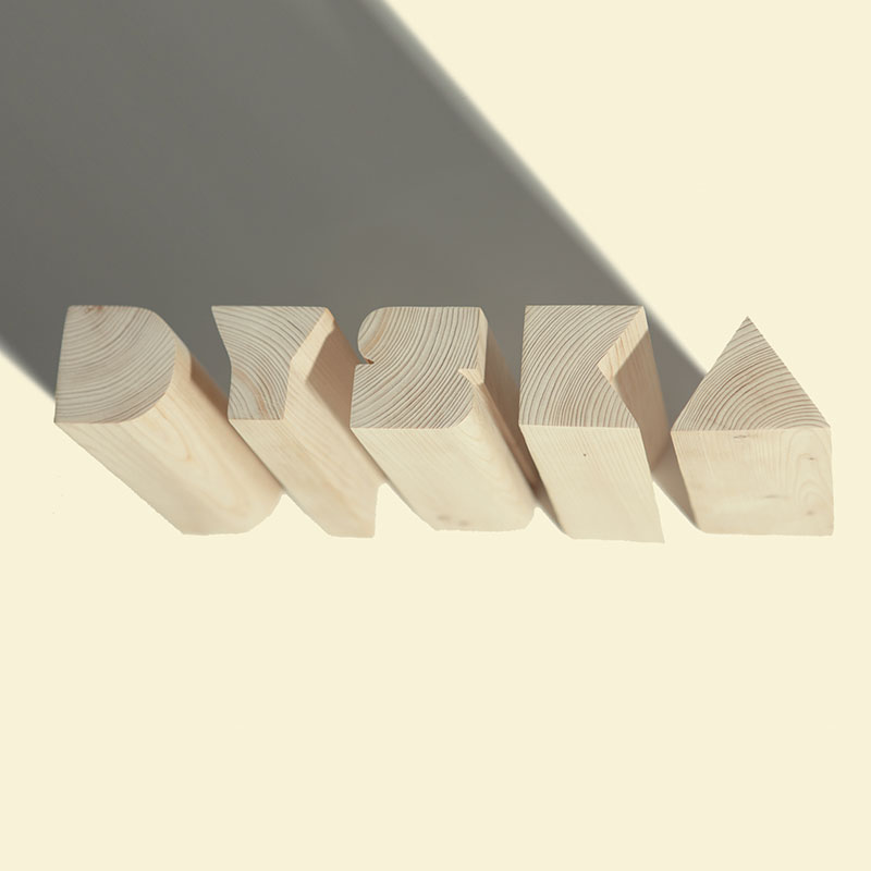
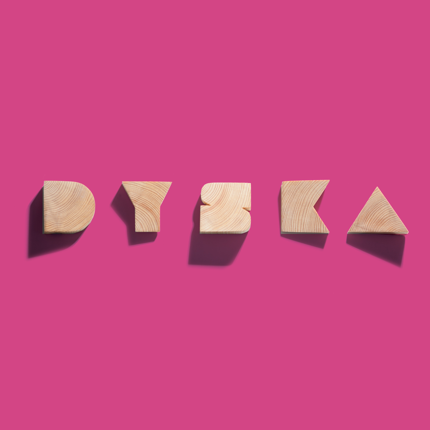
My favorite shots ended up being the series that used only the letterforms. None of the city scenes felt as compelling as the simplicity of type and shadows against white. Then when I saw how those shadows played against the varied angles of those skewed letter slices, I knew I had found the album cover. Only some positioning and minor Photoshop work were needed to add the desired visual polish to the image.
Final Mix
The name Parts and Pieces came readily from the uniqueness of our song selection on the album, the literal parts and pieces used to create the album art, and even alluding to the band members' diverse backgrounds.
